Going up
SteveC2018-09-06T16:31:42+00:00
Going up
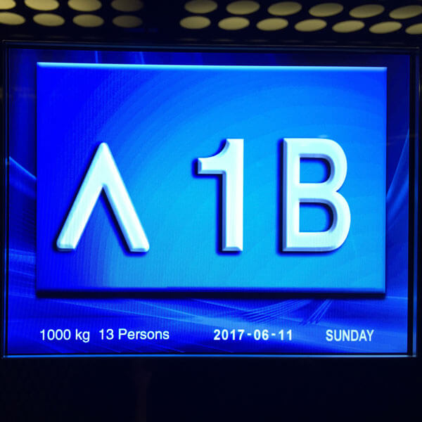
I remember when lifts didn’t have colour screens. But hey, why not make the most of it? And don’t worry about designing a custom up arrow.

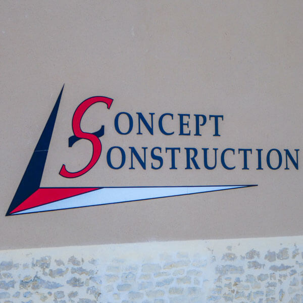
See how they’ve put the two letter Cs together, with one flipped upside down? Clever, or what? What. It’s not supposed to be an S.

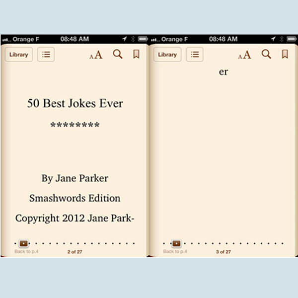
Layout really does matter. Yes, even on a Kindle app on an iPhone. I wish publishers would take Kindle publishing seriously.

Let’s have a spacey font for Festival. With a fancy F. And something different for Asia. Maybe in a bigger font. And how about a yin yang symbol too.

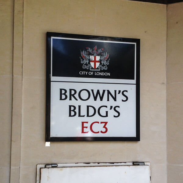
Such a pity they didn’t have room on that wall to make the sign a little wider, so the whole word Buildings could fit in. Oh wait – they did.