Unnecessary Cont[r]action
David Asch2018-09-15T19:50:42+00:00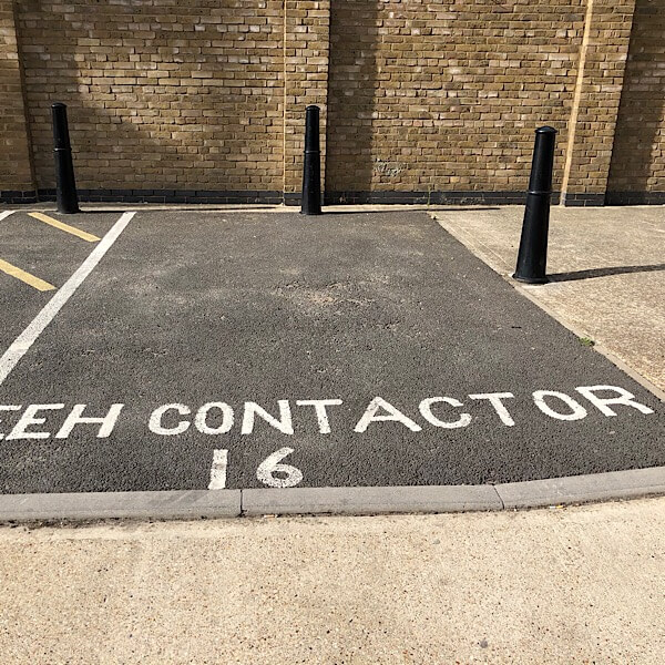
Unnecessary Cont[r]action
“What about the missing R?”
“Never mind, just make the A bigger.”

“What about the missing R?”
“Never mind, just make the A bigger.”
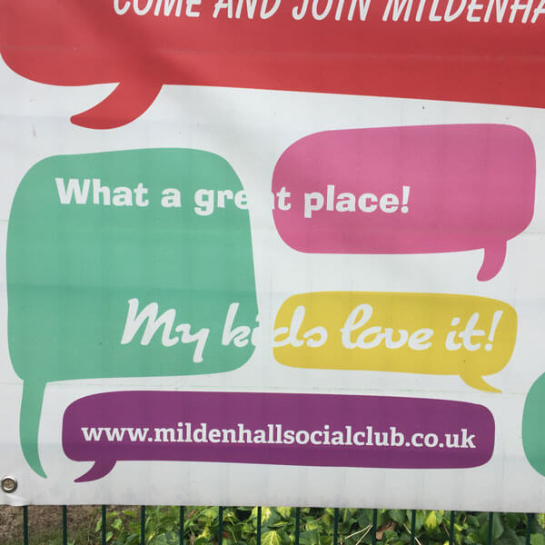
White text works fine on a coloured background. It doesn’t work so well on a white background. It always helps to take a look at your design before you get it printed.
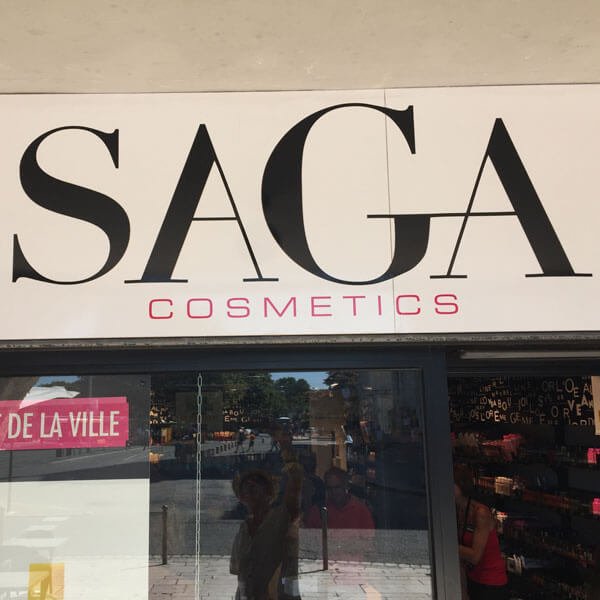
Why did they make the G so large? So they could tie the crossbar into the A, of course. Why did they flip the first A so it’s back to front? No idea.
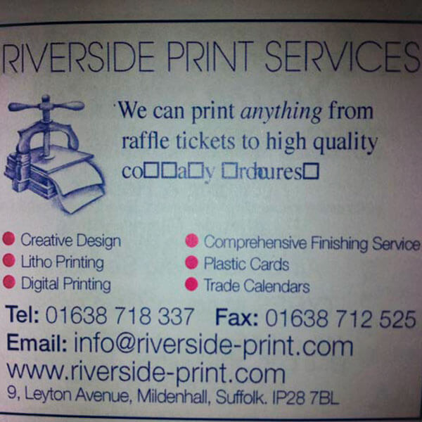
They can print anything, from raffle tickets to high quality… er… um. The trouble is, these printers also printed this cricket club magazine. Maybe they should stick to raffle tickets.
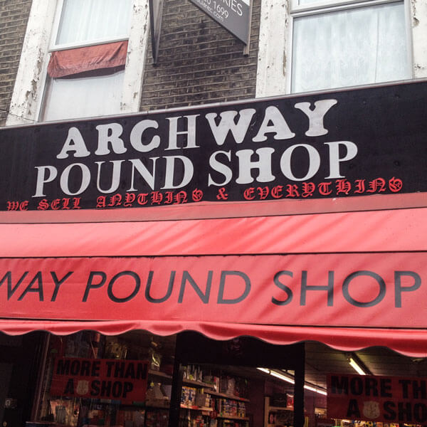
An H in one font is the same as an H in the other, right? And what does it matter if the C is upside down, and the W, Y and U are the wrong way round. Love that gothic script subtitle.
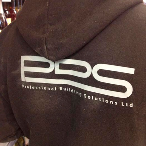
If you want a professional builder, be sure to call PDS. Oh wait – better make that PBS, as that’s the name of the company. A professional outfit, certainly.
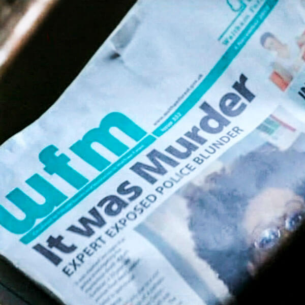
Have you ever seen a newspaper with a random word capitalised in a headline? Don’t the graphic designers who work on TV shows ever look at real newspapers?
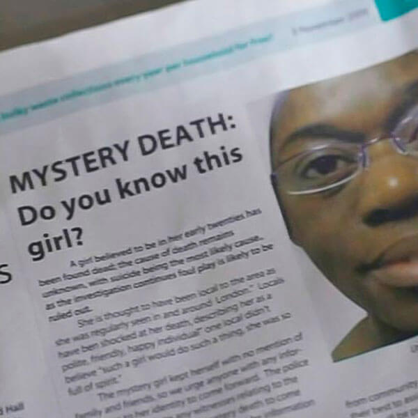
Another newspaper from a TV show. No subeditor would ever write a subhead with one word on the last line. Or indent the first paragraph of a story.
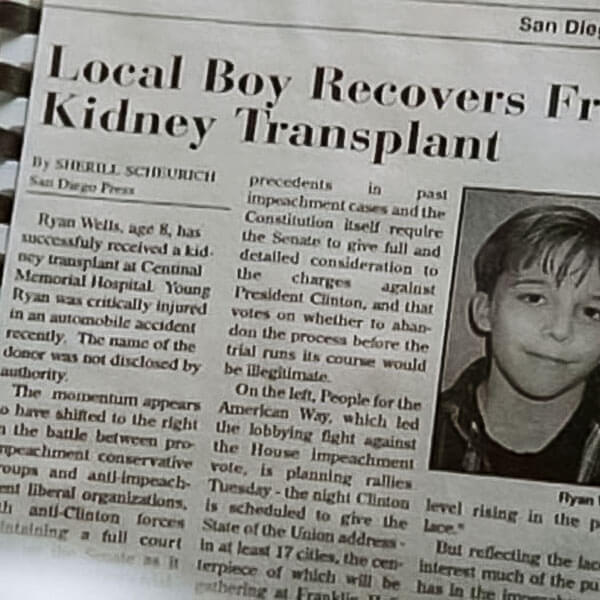
Newspapers in TV shows always get it wrong. First paragraph shouldn’t be indented, and it should be justified. And the rest of the article, if you freeze frame, is about impeaching Bill Clinton.
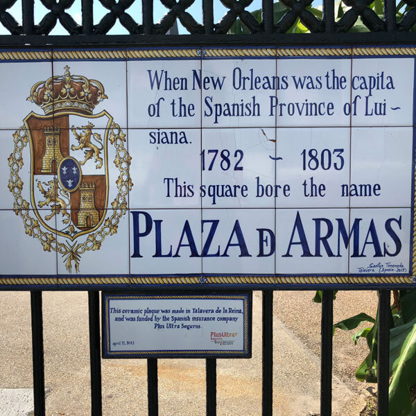
A lovingly handmade sign. Shame the last letter of ‘capital’ is missing. And ‘Louisiana’ is hyphenated. And misspelled. Still, you have to admire that stylised ‘de’ in the last line.