A taste of luxury
SteveC2018-09-06T16:31:55+00:00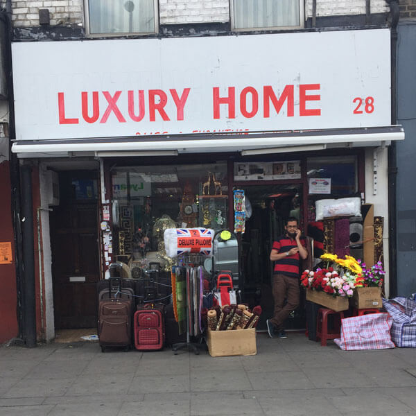
A taste of luxury
If you want your homeware store to look really, you know, classy, you can’t beat a top-notch sign for that extra touch of elegance.

If you want your homeware store to look really, you know, classy, you can’t beat a top-notch sign for that extra touch of elegance.
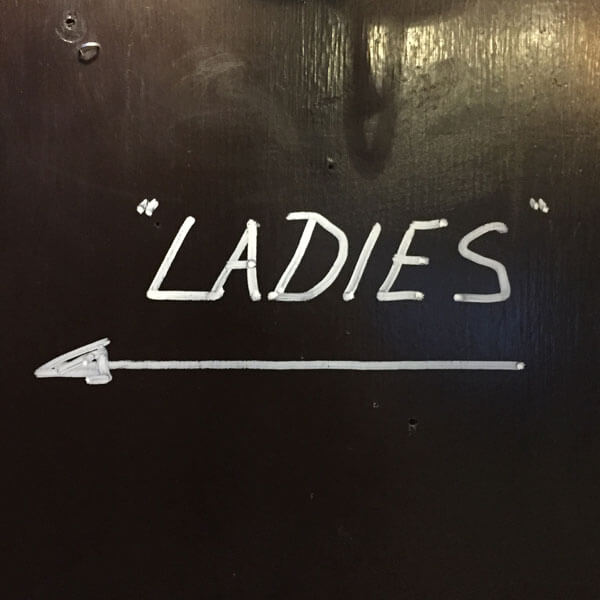
A sign for a toilet in a pub in Islington that’s not for ladies, but “ladies”. Perhaps they’re expecting an influx of drag queens.
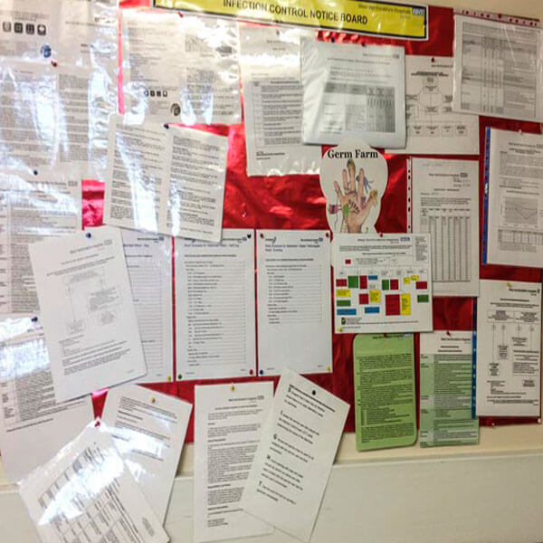
The Infection Control Notice Board. Some of this information is probably really important. Such a shame you can’t read any of it.

Great to have your name on the back of your truck. And remember to add your phone number, too, just in case anyone wants to get in touch.

After all, why go to the trouble of making a whole new sign when you can just amend the carefully crafted one you’ve already got?
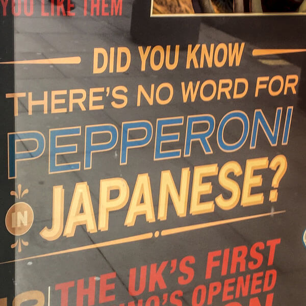
Domino’s Pizza tells us gleefully that there’s no word for pepperoni in Japanese. How comical! Of course, there’s no word for pepperoni in English either. Or ‘pizza’, come to that.
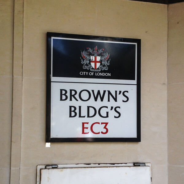
Such a pity they didn’t have room on that wall to make the sign a little wider, so the whole word Buildings could fit in. Oh wait – they did.

The U lines up with the C. Reformed lines up with nothing. Shame the House is drifting away. Maybe it’s embarrassed to be in italics?

![]()
Why the random sizes and malformed letters? On their website, Brett proudly shows how the logo can be reassembled to make a rectangle. So there you go, there’s a logic to it after all.