Unnecessary Cont[r]action
David Asch2018-09-15T19:50:42+00:00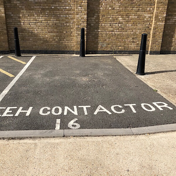
Unnecessary Cont[r]action
“What about the missing R?”
“Never mind, just make the A bigger.”

“What about the missing R?”
“Never mind, just make the A bigger.”
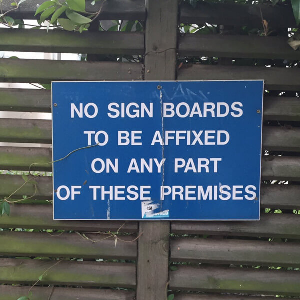
I think I’ve spotted an infringement…
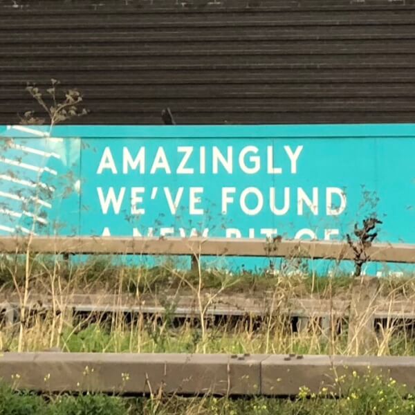
An advertising hoarding for the Greenwich Peninsula development. Is it the designer’s fault the barrier obscures the text? Yes. The sign only appears in this one location, which they should have checked out first. Sloppy.
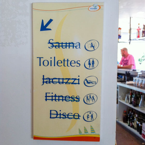
Those staff cutbacks must really be hurting. Still, no need to go to the expense of getting a whole new sign made.
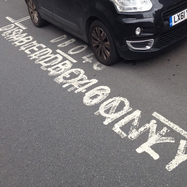
You can’t park here. Someone else can. But I have no idea who. First time I’ve seen a disabled parking bay that really is disabled.
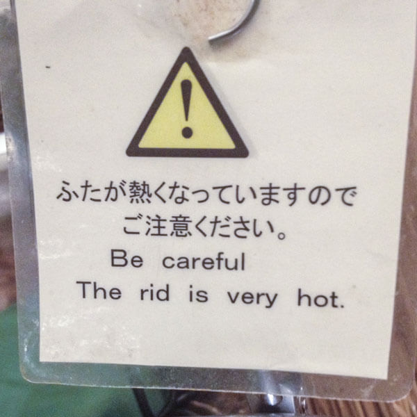
I know Japanese people have difficulty telling the difference between L and R in speech, but – in print as well? Maybe they took dictation over the phone.
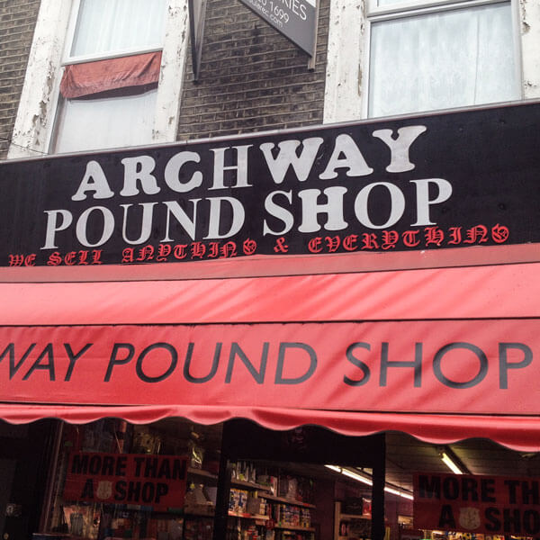
An H in one font is the same as an H in the other, right? And what does it matter if the C is upside down, and the W, Y and U are the wrong way round. Love that gothic script subtitle.
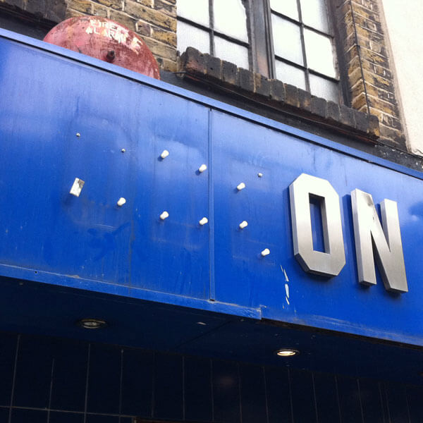
Oh dear. Odeon have really let themselves go. Still, somewhere there’s a youth with three interestingly shaped coffee tables.
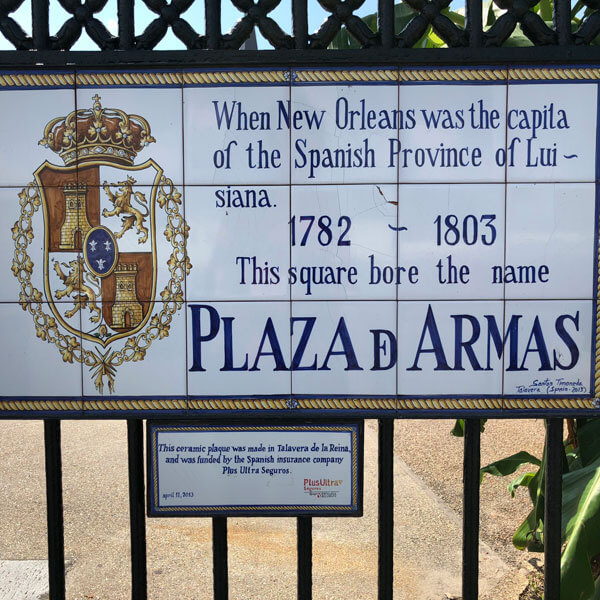
A lovingly handmade sign. Shame the last letter of ‘capital’ is missing. And ‘Louisiana’ is hyphenated. And misspelled. Still, you have to admire that stylised ‘de’ in the last line.