Say it large
SteveC2018-09-06T16:30:49+00:00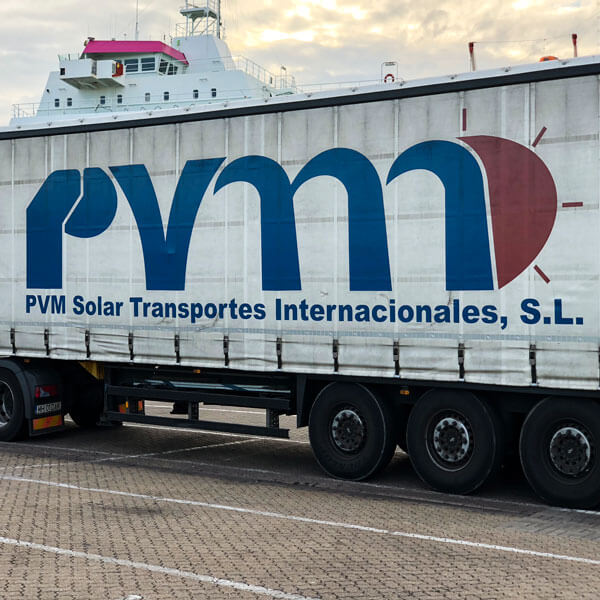
Say it large
It’s hard to imagine how this logo came about. Perhaps it represents trees? You have to love that sun at the end. With its four sad rays.

It’s hard to imagine how this logo came about. Perhaps it represents trees? You have to love that sun at the end. With its four sad rays.
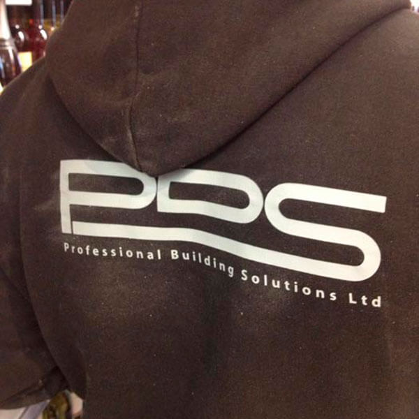
If you want a professional builder, be sure to call PDS. Oh wait – better make that PBS, as that’s the name of the company. A professional outfit, certainly.
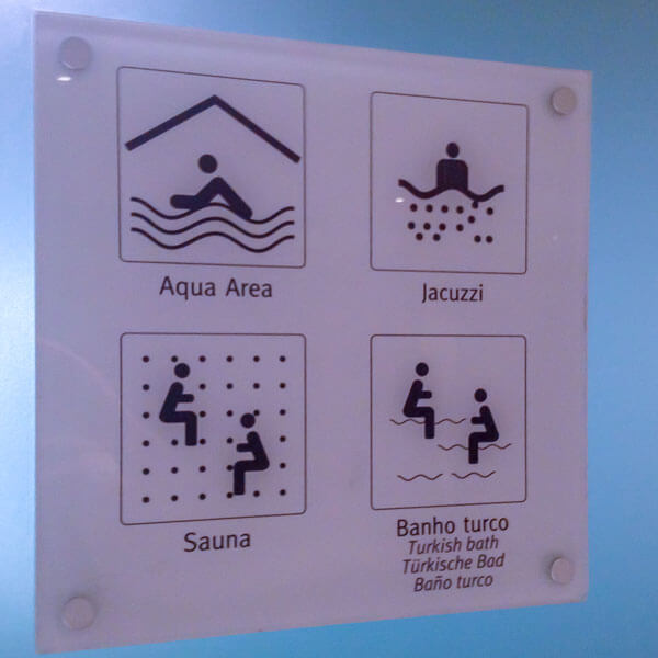
Shame none of the people look like they’re enjoying themselves. Especially the couple dodging bullets in the sauna, and the pair riding snakes in the Turkish bath.
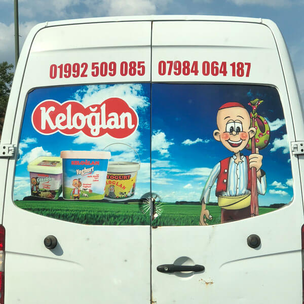
Three pots of yoghurt float at a weird angle above the landscape. Accompanied by a cheeky gypsy wearing a skullcap. Now that’s how to sell yoghurt.

See how they’ve put the two letter Cs together, with one flipped upside down? Clever, or what? What. It’s not supposed to be an S.
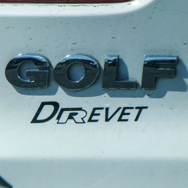
Who wants boring typography on their shiny new Golf? Or even their tatty old Golf? Let’s make that car showroom name really stand out.
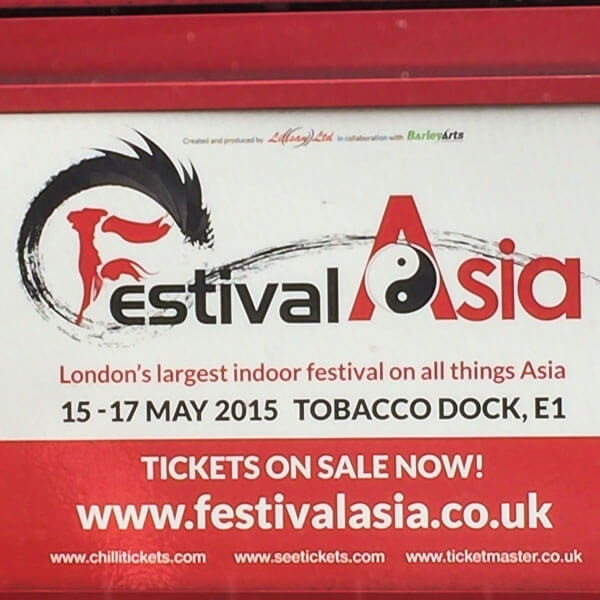
Let’s have a spacey font for Festival. With a fancy F. And something different for Asia. Maybe in a bigger font. And how about a yin yang symbol too.
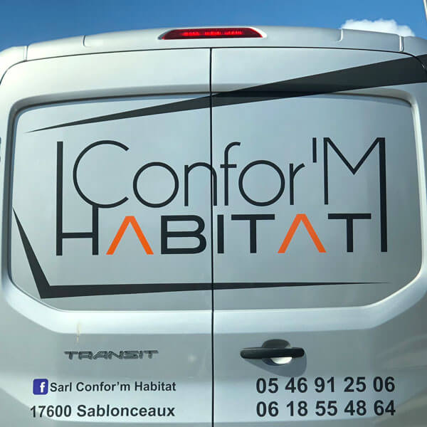
This French door manufacturer has thrown everything they can think of at their logo. Don’t look at it for too long. It will make you ill.
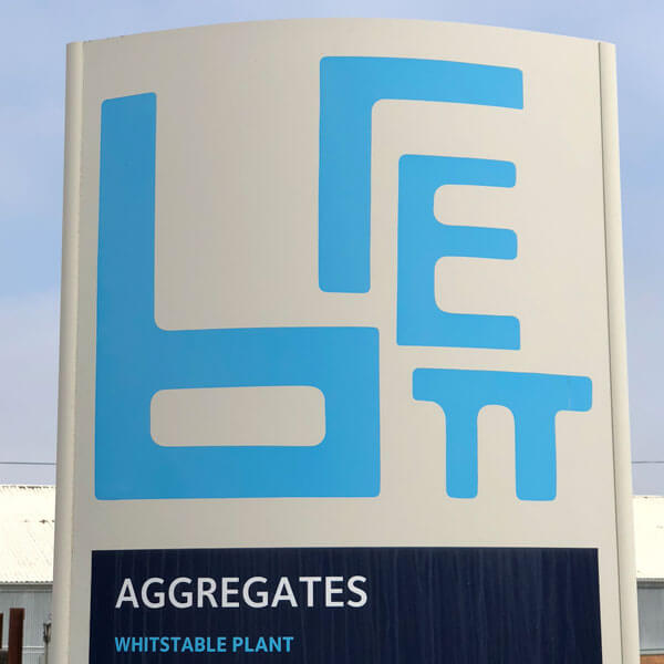
![]()
Why the random sizes and malformed letters? On their website, Brett proudly shows how the logo can be reassembled to make a rectangle. So there you go, there’s a logic to it after all.
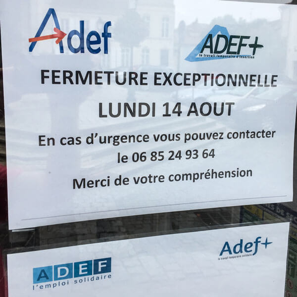
A notice from French employment agency Adef features their logo. And an alternative logo. And the notice beneath has two more versions of the same logo.