Going up
SteveC2018-09-06T16:31:42+00:00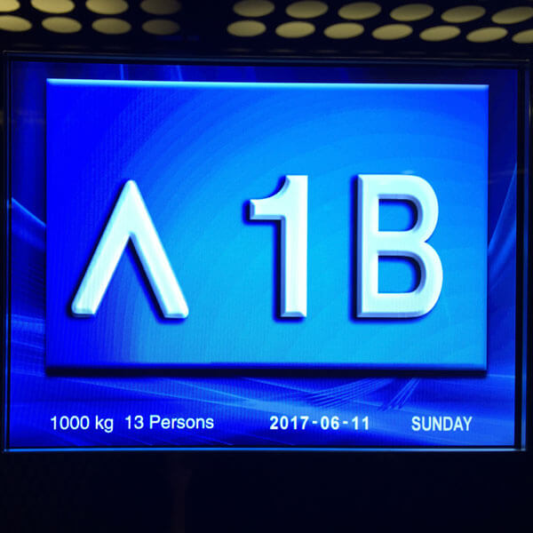
Going up
I remember when lifts didn’t have colour screens. But hey, why not make the most of it? And don’t worry about designing a custom up arrow.
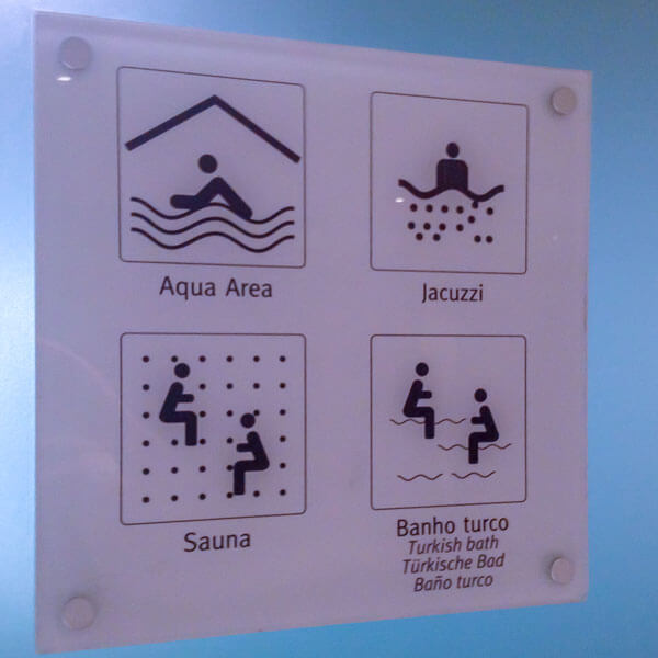
Shame none of the people look like they’re enjoying themselves. Especially the couple dodging bullets in the sauna, and the pair riding snakes in the Turkish bath.
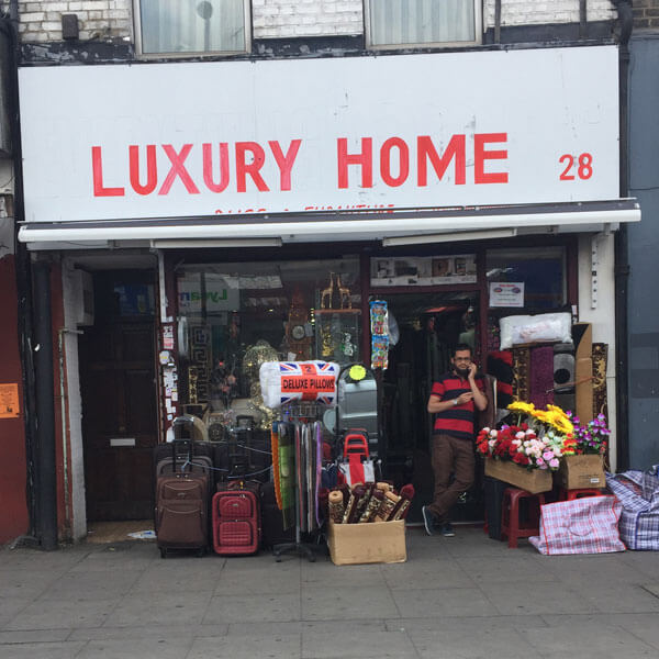
If you want your homeware store to look really, you know, classy, you can’t beat a top-notch sign for that extra touch of elegance.
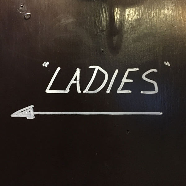
A sign for a toilet in a pub in Islington that’s not for ladies, but “ladies”. Perhaps they’re expecting an influx of drag queens.
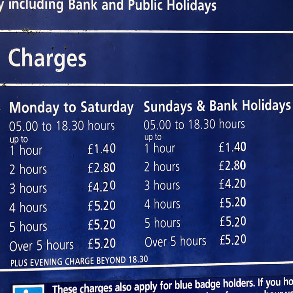
I always think it’s important to differentiate between weekdays and weekends, especially when announcing parking charges.

Three pots of yoghurt float at a weird angle above the landscape. Accompanied by a cheeky gypsy wearing a skullcap. Now that’s how to sell yoghurt.
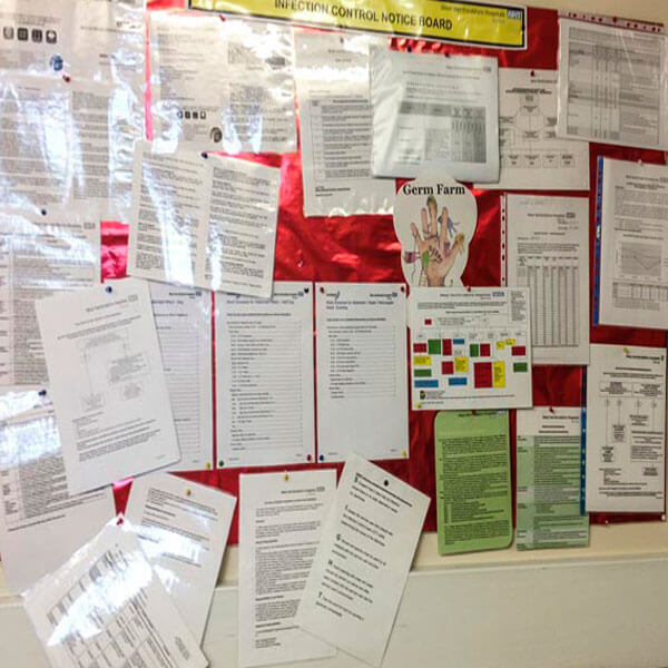
The Infection Control Notice Board. Some of this information is probably really important. Such a shame you can’t read any of it.

See how they’ve put the two letter Cs together, with one flipped upside down? Clever, or what? What. It’s not supposed to be an S.

Who wants boring typography on their shiny new Golf? Or even their tatty old Golf? Let’s make that car showroom name really stand out.
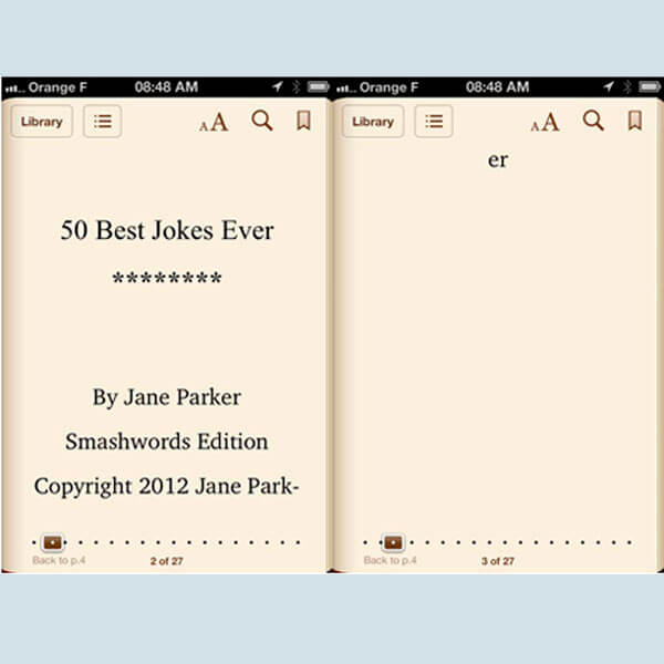
Layout really does matter. Yes, even on a Kindle app on an iPhone. I wish publishers would take Kindle publishing seriously.