Say it large
SteveC2018-09-06T16:30:49+00:00
Say it large
It’s hard to imagine how this logo came about. Perhaps it represents trees? You have to love that sun at the end. With its four sad rays.

It’s hard to imagine how this logo came about. Perhaps it represents trees? You have to love that sun at the end. With its four sad rays.
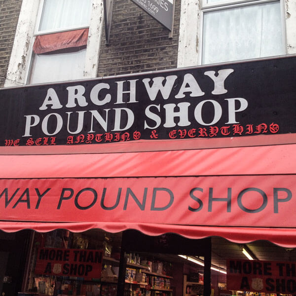
An H in one font is the same as an H in the other, right? And what does it matter if the C is upside down, and the W, Y and U are the wrong way round. Love that gothic script subtitle.
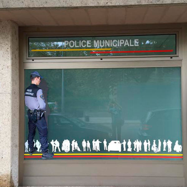
What better way to decorate the window of a police station that to have a copper standing in the window. Apparently relieving himself. Is that strictly legal?
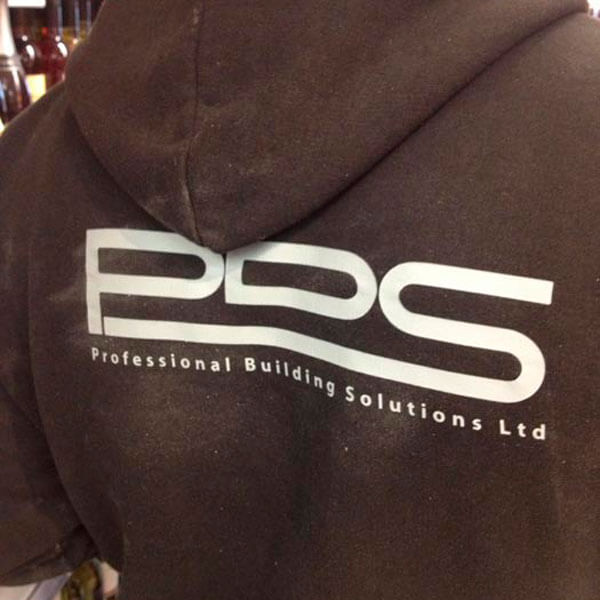
If you want a professional builder, be sure to call PDS. Oh wait – better make that PBS, as that’s the name of the company. A professional outfit, certainly.
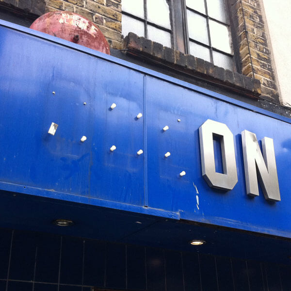
Oh dear. Odeon have really let themselves go. Still, somewhere there’s a youth with three interestingly shaped coffee tables.
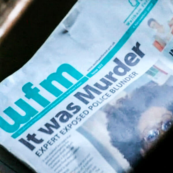
Have you ever seen a newspaper with a random word capitalised in a headline? Don’t the graphic designers who work on TV shows ever look at real newspapers?
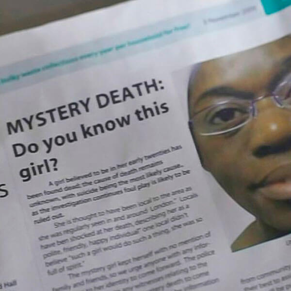
Another newspaper from a TV show. No subeditor would ever write a subhead with one word on the last line. Or indent the first paragraph of a story.
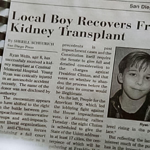
Newspapers in TV shows always get it wrong. First paragraph shouldn’t be indented, and it should be justified. And the rest of the article, if you freeze frame, is about impeaching Bill Clinton.
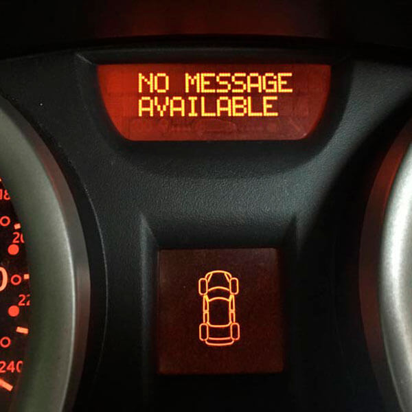
Very informative, my car. Always keen to tell me the latest news. Even when there isn’t any news to tell. That’s the message, or lack of message.
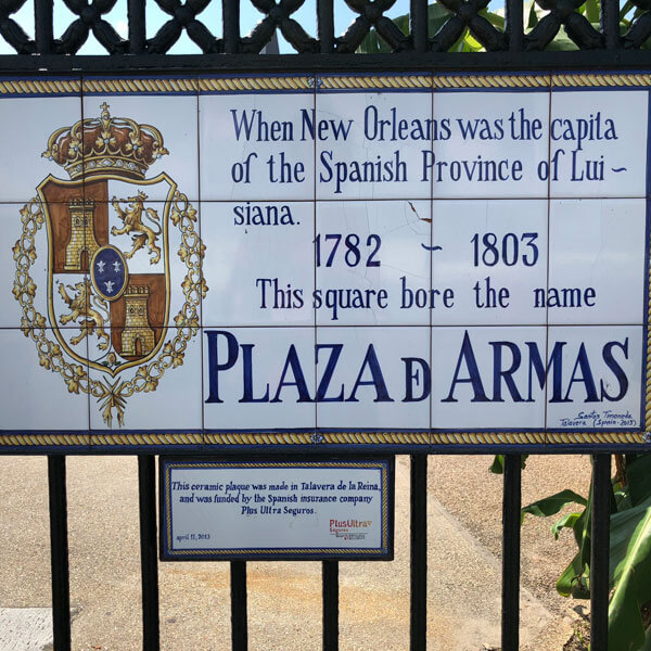
A lovingly handmade sign. Shame the last letter of ‘capital’ is missing. And ‘Louisiana’ is hyphenated. And misspelled. Still, you have to admire that stylised ‘de’ in the last line.