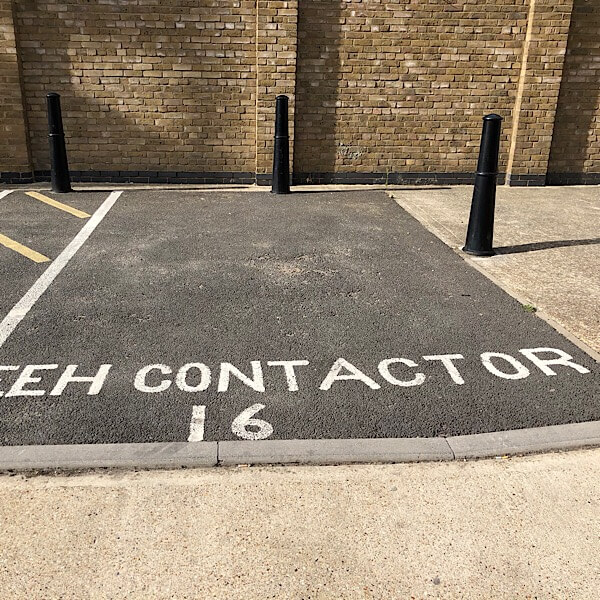
Unnecessary Cont[r]action
“What about the missing R?”
“Never mind, just make the A bigger.”
Location: Bow, East London
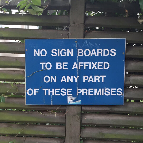
No sign of a sign
I think I’ve spotted an infringement…
Location: Camden, London
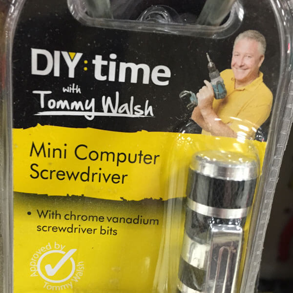
Get a man in
Cheeky chappie Tommy Walsh is a ‘celebrity builder’. And while I’d trust him to plaster a wall, I wouldn’t let him anywhere near my computer. Especially with that drill.
Location: Poundland
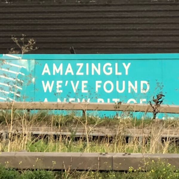
A new bit of…?
An advertising hoarding for the Greenwich Peninsula development. Is it the designer’s fault the barrier obscures the text? Yes. The sign only appears in this one location, which they should have checked out first. Sloppy.
Location: Greenwich, London
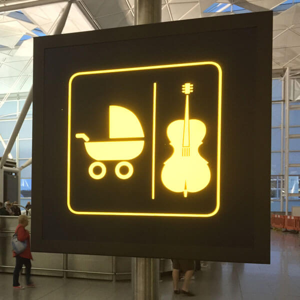
Musical babies only
A bizarre airport sign: you can leave your pram here. Or your cello. Is that it? Or are there other items that can be deposited here?
Location: Stansted Airport
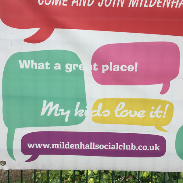
White? Not right
White text works fine on a coloured background. It doesn’t work so well on a white background. It always helps to take a look at your design before you get it printed.
Location: Mildenhall, Suffolk
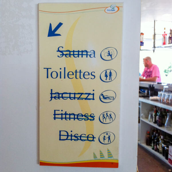
Use our facilities
Those staff cutbacks must really be hurting. Still, no need to go to the expense of getting a whole new sign made.
Location: La Rochelle, France
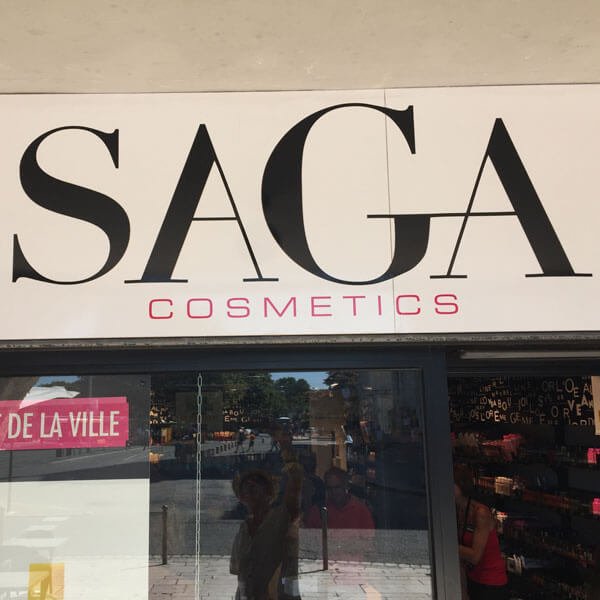
A sorry saga
Why did they make the G so large? So they could tie the crossbar into the A, of course. Why did they flip the first A so it’s back to front? No idea.
Location: La Rochelle, France
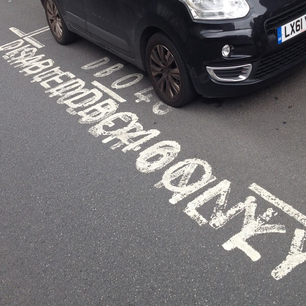
Parking restriction
You can’t park here. Someone else can. But I have no idea who. First time I’ve seen a disabled parking bay that really is disabled.
Location: London
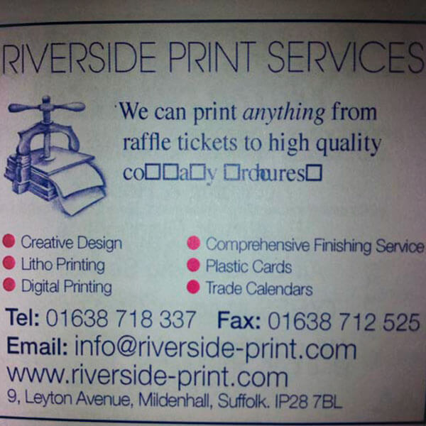
High quality co a y rdcures
They can print anything, from raffle tickets to high quality… er… um. The trouble is, these printers also printed this cricket club magazine. Maybe they should stick to raffle tickets.
Location: Mildenhall, Suffolk

Carefur! Hot rid!
I know Japanese people have difficulty telling the difference between L and R in speech, but – in print as well? Maybe they took dictation over the phone.
Location: hotel in Tokyo
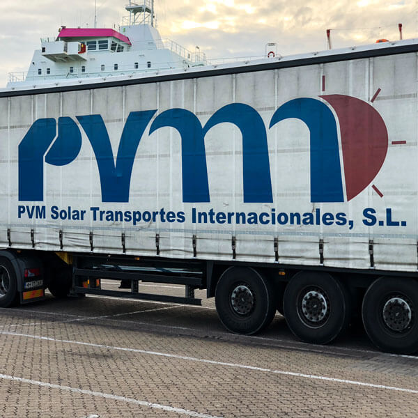
Say it large
It’s hard to imagine how this logo came about. Perhaps it represents trees? You have to love that sun at the end. With its four sad rays.
Location: ferry port, Portsmouth
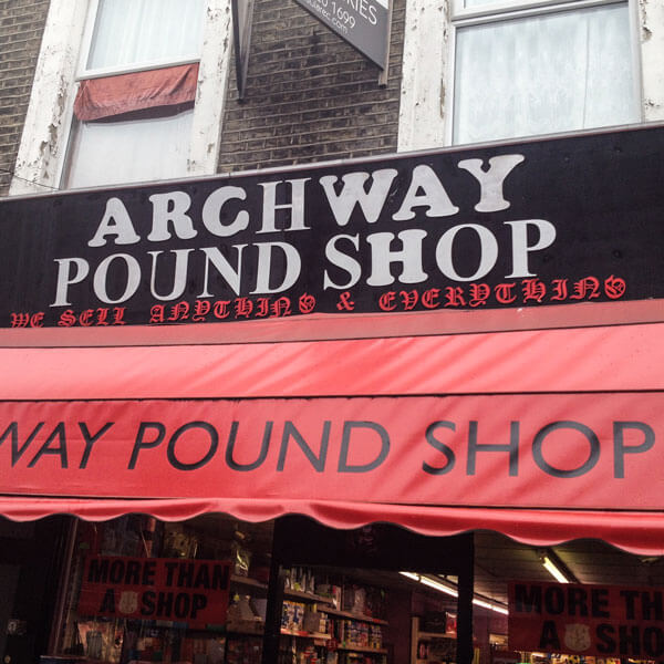
Saving pounds and pennies
An H in one font is the same as an H in the other, right? And what does it matter if the C is upside down, and the W, Y and U are the wrong way round. Love that gothic script subtitle.
Location: Archway, London
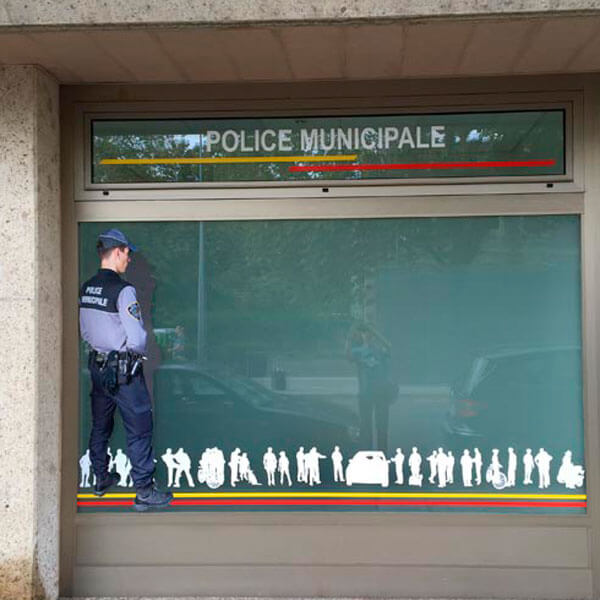
Police business
What better way to decorate the window of a police station that to have a copper standing in the window. Apparently relieving himself. Is that strictly legal?
Location: Geneva
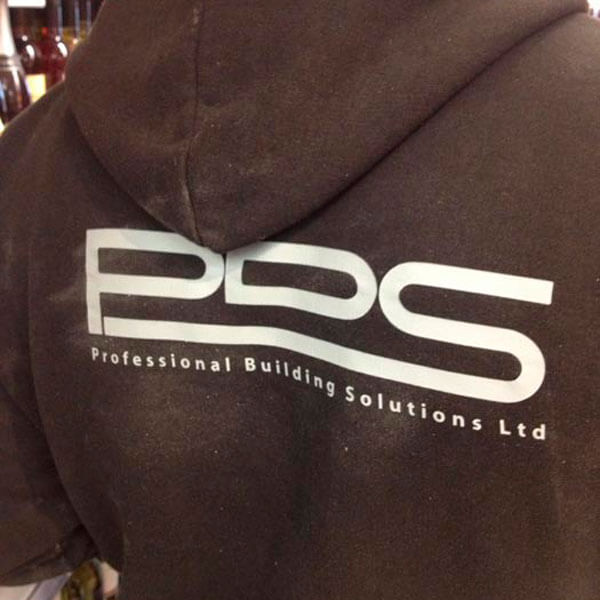
Professional solutions
If you want a professional builder, be sure to call PDS. Oh wait – better make that PBS, as that’s the name of the company. A professional outfit, certainly.
Location: central London
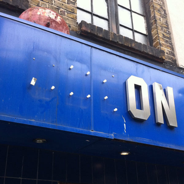
Fanatical about signage
Oh dear. Odeon have really let themselves go. Still, somewhere there’s a youth with three interestingly shaped coffee tables.
Location: Soho, London
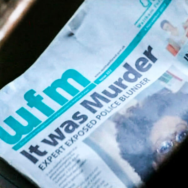
Newspaper blues, pt 3
Have you ever seen a newspaper with a random word capitalised in a headline? Don’t the graphic designers who work on TV shows ever look at real newspapers?
Location: Spooks, TV show
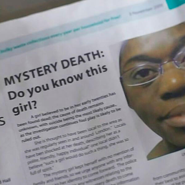
Newspaper blues, pt 2
Another newspaper from a TV show. No subeditor would ever write a subhead with one word on the last line. Or indent the first paragraph of a story.
Location: Spooks, TV show
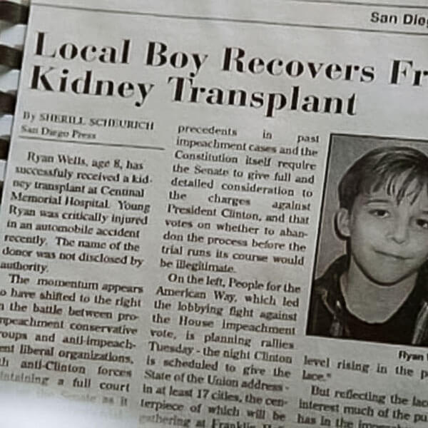
Newspaper blues, pt 1
Newspapers in TV shows always get it wrong. First paragraph shouldn’t be indented, and it should be justified. And the rest of the article, if you freeze frame, is about impeaching Bill Clinton.
Location: The Pretender, TV show
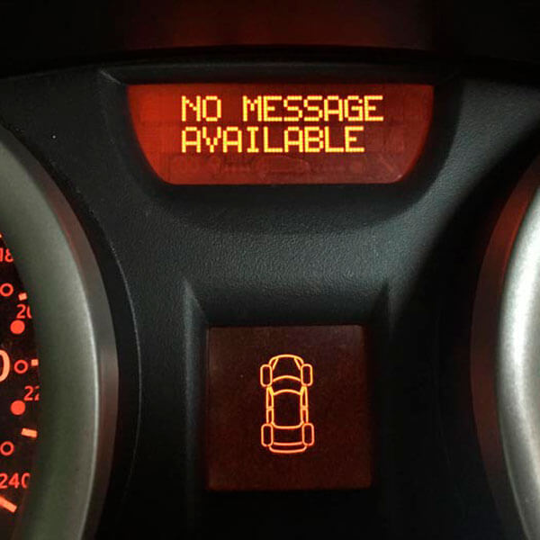
It’s all in the message
Very informative, my car. Always keen to tell me the latest news. Even when there isn’t any news to tell. That’s the message, or lack of message.
Location: Ford Galaxy
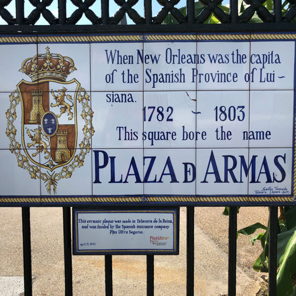
Louisiana blues
A lovingly handmade sign. Shame the last letter of ‘capital’ is missing. And ‘Louisiana’ is hyphenated. And misspelled. Still, you have to admire that stylised ‘de’ in the last line.
Location: New Orleans
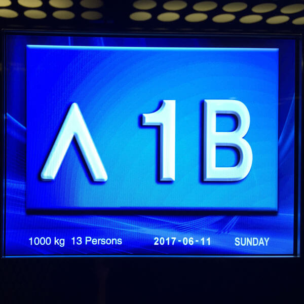
Going up
I remember when lifts didn’t have colour screens. But hey, why not make the most of it? And don’t worry about designing a custom up arrow.
Location: hotel, Oslo
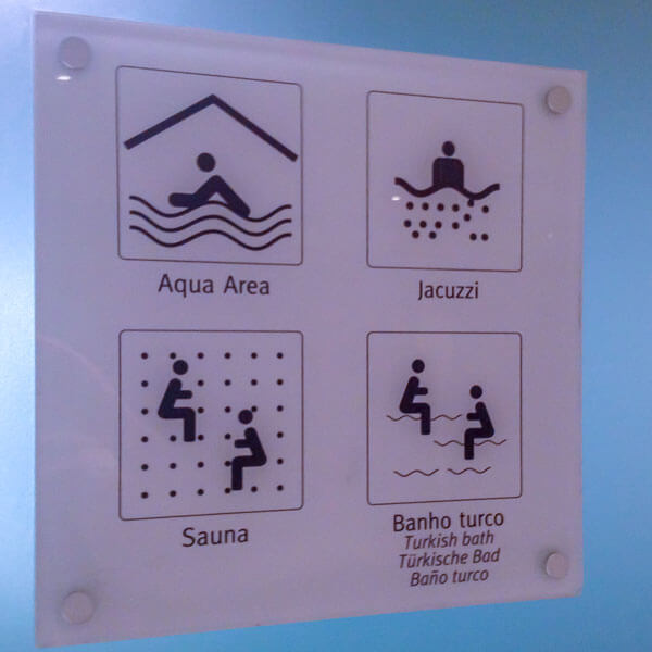
Aqua icons
Shame none of the people look like they’re enjoying themselves. Especially the couple dodging bullets in the sauna, and the pair riding snakes in the Turkish bath.
Location: hotel, Madeira
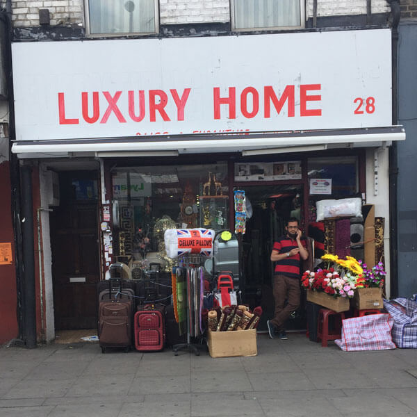
A taste of luxury
If you want your homeware store to look really, you know, classy, you can’t beat a top-notch sign for that extra touch of elegance.
Location: Holloway, London
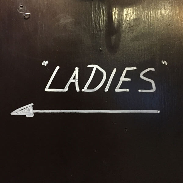
This way, laydeez
A sign for a toilet in a pub in Islington that’s not for ladies, but “ladies”. Perhaps they’re expecting an influx of drag queens.
Location: Islington, London
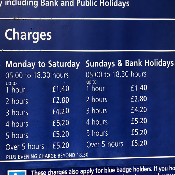
Weeks and weekends
I always think it’s important to differentiate between weekdays and weekends, especially when announcing parking charges.
Location: car park, Norwich
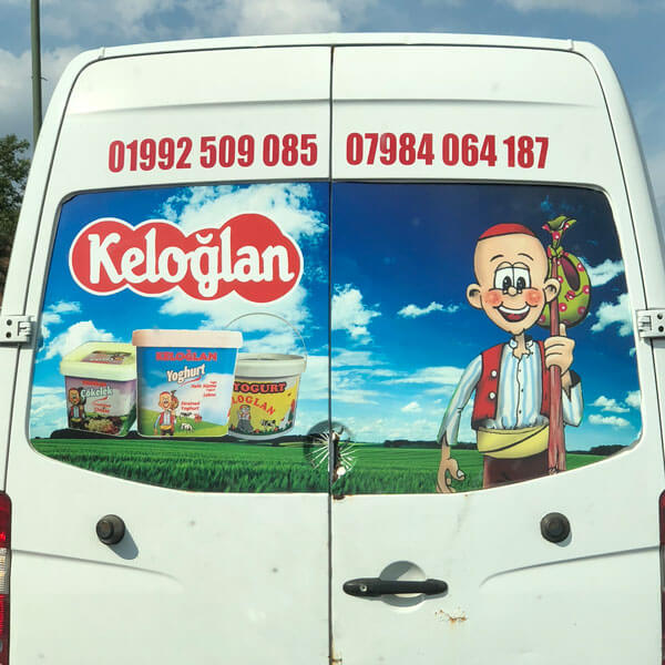
Distasteful yoghurt
Three pots of yoghurt float at a weird angle above the landscape. Accompanied by a cheeky gypsy wearing a skullcap. Now that’s how to sell yoghurt.
Location: motorway near Portsmouth
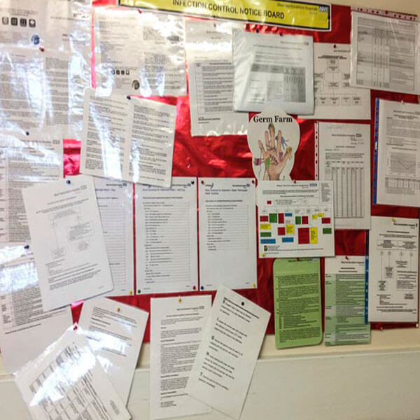
Germ warfare
The Infection Control Notice Board. Some of this information is probably really important. Such a shame you can’t read any of it.
Location: Hospital, Watford
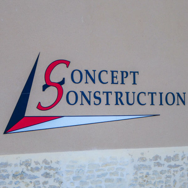
Concept destruction
See how they’ve put the two letter Cs together, with one flipped upside down? Clever, or what? What. It’s not supposed to be an S.
Location: near La Rochelle, France
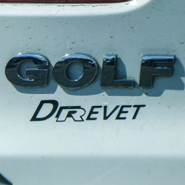
Round of golf?
Who wants boring typography on their shiny new Golf? Or even their tatty old Golf? Let’s make that car showroom name really stand out.
Location: back of a car, France
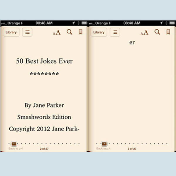
Kindle katastrophe
Layout really does matter. Yes, even on a Kindle app on an iPhone. I wish publishers would take Kindle publishing seriously.
Location: iOS Kindle app
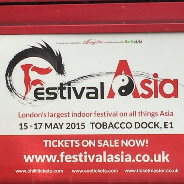
Festival typographic
Let’s have a spacey font for Festival. With a fancy F. And something different for Asia. Maybe in a bigger font. And how about a yin yang symbol too.
Location: back of a bus, London
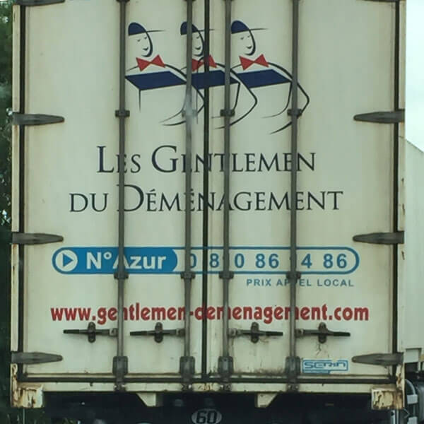
Les gentlemen de…
Great to have your name on the back of your truck. And remember to add your phone number, too, just in case anyone wants to get in touch.
Location: Motorway near Niort, France
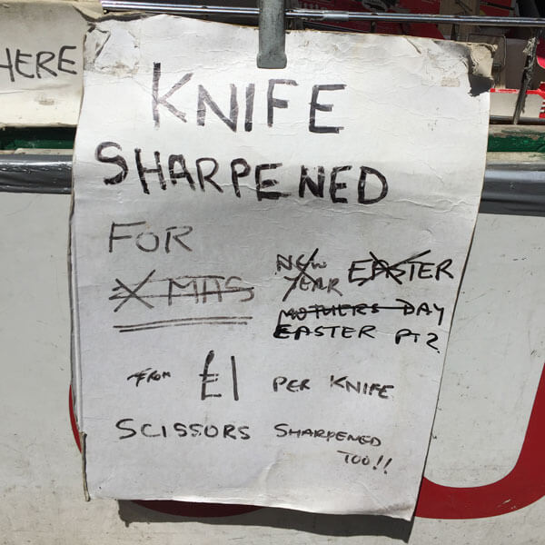
Sharpest knife in the box
After all, why go to the trouble of making a whole new sign when you can just amend the carefully crafted one you’ve already got?
Location: Suffolk
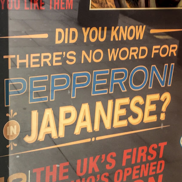
No word for pizza
Domino’s Pizza tells us gleefully that there’s no word for pepperoni in Japanese. How comical! Of course, there’s no word for pepperoni in English either. Or ‘pizza’, come to that.
Location: London
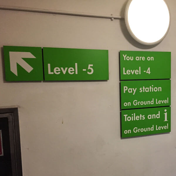
Level up
You enter the car park on the ground floor. Level -1 is the layer beneath. Here, on Level -4, you have to climb the stairs to get to Level -5. Genius.
Location: Soho, London
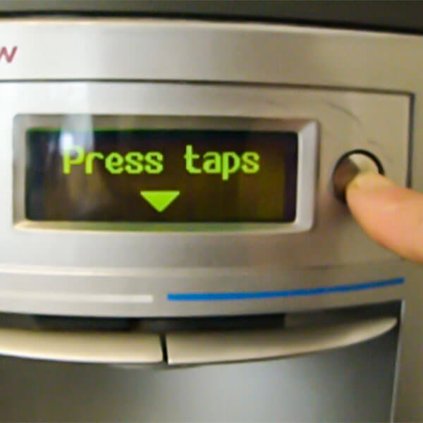
Taps and buttons
This water cooler has two buttons, two taps, and an LED screen. When you press either of the buttons, a message appears on the screen telling you to use the taps. There seems to be no other purpose to either.
Location: BBC Radio, London
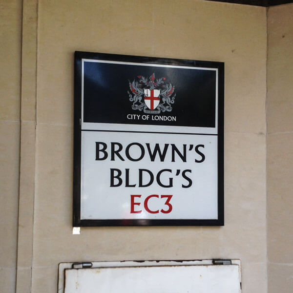
Bldng sgn’s
Such a pity they didn’t have room on that wall to make the sign a little wider, so the whole word Buildings could fit in. Oh wait – they did.
Location: London EC3

United malformed
The U lines up with the C. Reformed lines up with nothing. Shame the House is drifting away. Maybe it’s embarrassed to be in italics?
Location: Pimlico, London
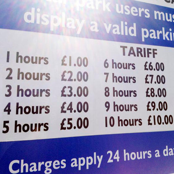
Car park charges
One hour for £1.00. Two hours for £2.00. Three hours for £3.00. Shall I go on? There must be a more concise way of getting this information across.
Location: Great Yarmouth
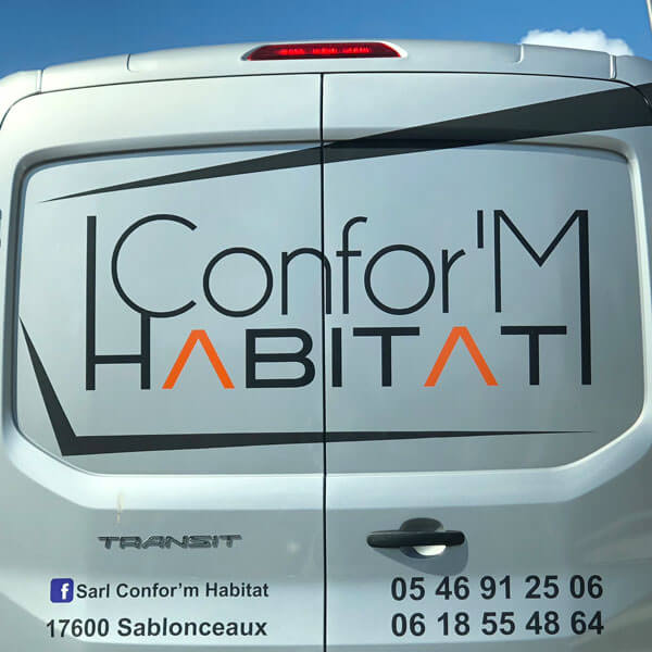
Conform? Non, merçi
This French door manufacturer has thrown everything they can think of at their logo. Don’t look at it for too long. It will make you ill.
Location: Motorway near Nantes, France
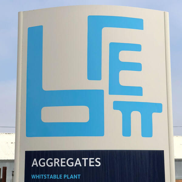
![]()
Build it with Brett
Why the random sizes and malformed letters? On their website, Brett proudly shows how the logo can be reassembled to make a rectangle. So there you go, there’s a logic to it after all.
Location: Whitstable
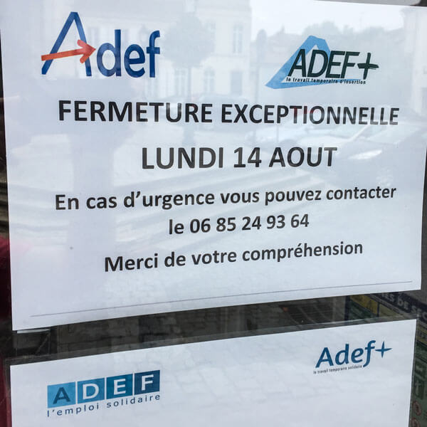
Pick a logo. Any logo.
A notice from French employment agency Adef features their logo. And an alternative logo. And the notice beneath has two more versions of the same logo.
Location: Saint-Jean d’Angély, France

Keep your brain healthy
Here’s one way to keep your brain healthy: don’t take it out of your head.
Location: The Guardian
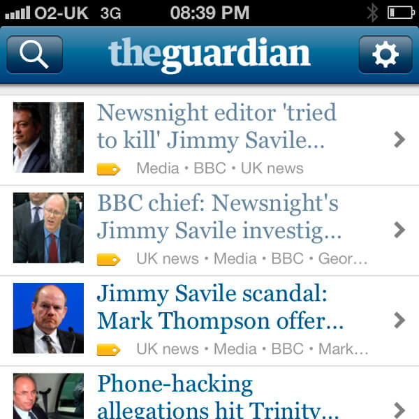
Newsnight homicide
‘Newsnight editor tried to kill Jimmy Savile story’. Subeditors really need to think about how their headlines are going to be truncated.
Location: Guardian iOS app

Unnecessary Cont[r]action
“What about the missing R?”
“Never mind, just make the A bigger.”
Location: Bow, East London

No sign of a sign
I think I’ve spotted an infringement…
Location: Camden, London

Get a man in
Cheeky chappie Tommy Walsh is a ‘celebrity builder’. And while I’d trust him to plaster a wall, I wouldn’t let him anywhere near my computer. Especially with that drill.
Location: Poundland

A new bit of…?
An advertising hoarding for the Greenwich Peninsula development. Is it the designer’s fault the barrier obscures the text? Yes. The sign only appears in this one location, which they should have checked out first. Sloppy.
Location: Greenwich, London

Musical babies only
A bizarre airport sign: you can leave your pram here. Or your cello. Is that it? Or are there other items that can be deposited here?
Location: Stansted Airport

White? Not right
White text works fine on a coloured background. It doesn’t work so well on a white background. It always helps to take a look at your design before you get it printed.
